
drivenn Follow
Get It On
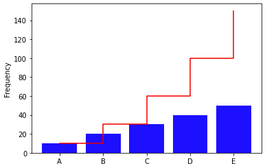
A Pareto chart is a type of visual representation that is used to display the relative importance of different factors in a set of data.
To create a Pareto chart in Python, you can use the Matplotlib library.
Here's an example of how you can create a simple Pareto chart using Matplotlib:
Personal Text Here